Solved

Move "tasks" back to the right side! 😡

  • May 6, 2025
  • 53 replies
  • 364 views

Alice Brown

Why Did You Fix What Wasn’t Broken, HoneyBook


Dear HoneyBook,

I’ve been a loyal user for some time now, and while I appreciate many of the features your software offers, I’m really struggling with a recent update that I hope you’ll consider revisiting.

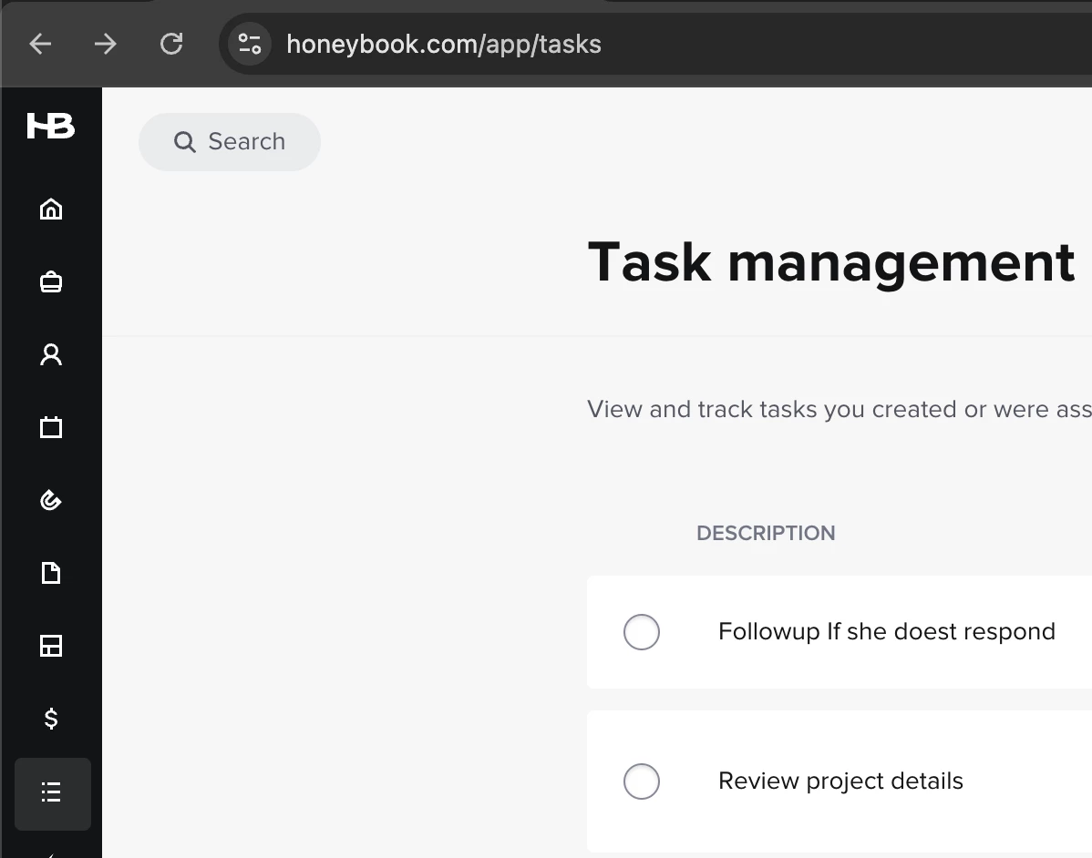
The recent move of the "Project Task" bar from the right side of the project files to the top has caused a major disruption in my workflow. Having the task bar on the right allowed me to quickly glance and assess where I stood within each project — from the stage of automation tasks, emails, brochures, and other key elements. It was also incredibly convenient to add tasks on the fly, such as my daily “Check In” reminders for specific clients, helping me stay on top of my workload without a hitch.

Now, with the task bar moved to the top, I’m forced to click through to the "Tasks" tab every time I need to check or add a task. Considering HoneyBook already has performance lag when switching between sections like Activity, Files, Notes, and Details, this extra step slows me down even further. Every second counts in my busy day, and these unnecessary clicks and delays add up.

Why fix something that wasn’t broken? I strongly urge you to reconsider this change and return the task bar to its original location on the right side of the project. It was an efficient, intuitive layout that worked for many of us who rely on HoneyBook for streamlined organization.

Please listen to your users and bring back the functionality we need!

Best answer by Amber Mitchell

1000% AGREED!!! HB please listen to your loyal user and change this back. I am on year 5 with HB and have loved ,ay changes but this one is directly taking money and time from me. My assistant times it and its taking an additional 10-16 seconds each task for each project. This is costing me cause I have 100’s of projects and tasks each. 

53 replies

PoshLifeDJ

I concur! I HATE the new location. It’s disrupted my workflow as well. 


Kellie Barclay

AGREED!!!!

It was all on one page for me - I just had to glance over to see what was needed. Now I have to flip to a new page. I don’t want to do that.

I just spent 15 minutes chatting with a help chat rep to see what was going on. It was JUST there earlier today and now it has moved.

Fix what is broken, don’t add shit that doesn’t need adding. This is a major work flow disruption for me as well.


Kellie Barclay

And they’ve also messed up the delete function for tasks. 

I have a two pronged task in my automation - one for “yes I’m available” or “no I’m not available” that I have to approve and send. When I send the “yes” I can delete the “no” - but there’s no option for that.


Alice Brown
  • Author
  • Newcomer
  • May 7, 2025

I’m genuinely struggling with this new task bar layout. Since the update moved it from the right side to the top, it’s completely thrown off my workflow — and I don’t think I’m alone.

🔹 My workaround is ridiculous. I’m now working with two windows open for one project — one for Activities, one just to keep the Tasks view open — so I can easily track where I’m at in my workflow. That is not a sustainable solution.

🔹 The lag is real. Navigating between tabs in a project was already slow. Now having to manually click “Tasks” at the top every time adds more clicks and more lag.

🔹 Marking tasks as complete is buggy. You click “mark as complete” and… nothing. No visual checkmark, no arrow. I refresh, wait, wonder if it worked in the background? 🤷🏻‍♀️ But how can I trust my automations are still functioning properly when there's no visible confirmation?


This change has made an already clunky experience much worse. Please be transparent:

👉 Will the task bar return to the right side with the trash can option?

👉 Can we get a timeline or update on this?


📢 If you agree, upvote this so HB knows this is disrupting real workflows. We need function and efficiency — not more clicks, lags, workarounds and confusion.


Marc Sense
  • Newcomer
  • May 7, 2025

new Tasks are 🗑


Bowtied With Love

Agreed, let’s move tasks back to the main project page. It totally messes things up to have them on a separate page and it slows down productivity. 


Alicia Bauer
Forum|alt.badge.img+4

@Alice Brown -  Thank you so much for sharing your experience in such a clear and detailed way. As a HoneyBook Pro, I work with business owners to help streamline their systems, and I want to start by saying—your feedback is 100% valid and truly appreciated.

I completely understand how shifting the project task bar has impacted your workflow, especially when you're managing a lot of moving pieces and time is at a premium.

You’re definitely not alone in noticing this change, and the fact that you took time to describe your workaround, the lag, and your concerns around trust in the automation flow speaks volumes. This kind of feedback is exactly what helps the HoneyBook team understand how real businesses are using the tools—and where things can be improved.

While I can’t speak to specific development timelines, I want to reassure you that these conversations are being heard. Sharing your experience here and upvoting is impactful, and you can also submit feature feedback directly through your account or reach out to support to ensure your voice is part of the bigger conversation.

In the meantime, if there’s anything I can do to help you work through a more efficient interim solution or if you'd like to explore whether your current workflow could be adapted in any way, I’m here and happy to help.

Thanks again for being so open about your experience. It really does make a difference. 💛

Just tagging a coupe of HB community leaders so they are able to send this feedback to the team: ​@Monica R and ​@Kait M 


Alice Brown
  • Author
  • Newcomer
  • May 7, 2025

Also now that the task bar has moved I can not delete a step in the automation. I wish the trash can was not removed. 


Alice Brown
  • Author
  • Newcomer
  • May 7, 2025

Hi, me again! 😊
Just wanted to add — in the previous task layout, we could easily see the dates that automation emails, brochures, or tasks were scheduled right within the task panel. That gave us a full picture of what was happening and when.

Now, with the new task location, it only shows the next upcoming automation, which really limits our ability to plan ahead and stay on top of the workflow.


Amber Mitchell
Forum|alt.badge.img

1000% AGREED!!! HB please listen to your loyal user and change this back. I am on year 5 with HB and have loved ,ay changes but this one is directly taking money and time from me. My assistant times it and its taking an additional 10-16 seconds each task for each project. This is costing me cause I have 100’s of projects and tasks each. 


Aimee Flynn
  • Newcomer
  • May 8, 2025

Came here to make a post on this very thing. This is a HORRIBLE update. My workflow is entirely dependent on being able to see the big picture of what’s ahead on my projects- the next task that’s due, as well as the ones down the road. I rely on this information while sending and responding to emails. To have to toggle back and forth, or have two windows open next to each other, is absolutely insane. I’ve been a HB user for 6 years, and this is by far the worst update I’ve experienced, bad enough to be the straw that breaks the camels back and have me go to another provider. The only way I’m able to stay organized is being able to see my “to-do’s” in the same window as my emails. 


Having to switch back and forth and remember dates, rather than just being able to *look over at them* is wasting my time and causing tons of frustration. Absolutely detrimental to my workflow. Please change this back. 


Veronica Brend

Agreed and while we’re talking tasks, why did they take out the ability to click into the project through the task list on the home page? I used to be able to see a task on the list, click the project, go right to their portal and do the thing. Now, I have to have 2 HB windows open to work through my task list, very annoying. 


Victoria Dunbar
Forum|alt.badge.img

Here to say the same thing!! The tasks feature is a MAJOR factor in my daily workflow and having to switch tabs to see what I have due for a project is a major inconvenience. Bring it back please!!!!


Kim M.
Forum|alt.badge.img
  • Newcomer
  • May 12, 2025

AGREEEEED!!!!!! HB why do you hate us!?


Victoria Dunbar
Forum|alt.badge.img

Why does it say solved… 😭


Stickler
Rising Star
Forum|alt.badge.img+1
  • Rising Star
  • May 13, 2025

So I am going to be the odd one out here. But I love that at least for the client side its at the top. This makes team members and clients aware and see the tasks. In my personal belief I rather it be hard for me, and easy for my client. Best case for it to be easy for both. 


Is there a compromise? Like a Task portal or something that helps you as the end user move through tasks quickly but still allows team members (without an account), 1099 staff, and clients have it at the top so the feature is used by them. My clients WOULD NEVER go search down the side. 


Thoughts? 


Victoria Dunbar
Forum|alt.badge.img

Stickler - I totally hear you on that! 


Since I don’t give tasks to my clients in that way I didn’t think about it in that sense. Maybe having it in the hidden side panel and the tab woud be best so each person has the choice! :) 


Stickler
Rising Star
Forum|alt.badge.img+1
  • Rising Star
  • May 14, 2025

Stickler - I totally hear you on that! 


Since I don’t give tasks to my clients in that way I didn’t think about it in that sense. Maybe having it in the hidden side panel and the tab woud be best so each person has the choice! :) 

Choice would be amazing


Kim Jundt
Forum|alt.badge.img
  • May 14, 2025

Hi HoneyBook team,

I just want to echo what many others have shared. The new task bar layout has really disrupted my workflow. What used to be a quick glance to the right now requires switching between tabs or opening multiple windows. It’s adding unnecessary time and making the platform feel harder to use.

I also rely on being able to delete certain tasks, see the full automation schedule, and trust that “mark as complete” actually registers. Right now, those features feel unclear or unavailable.

I understand that updates are part of improving the system, but this one has made something essential more difficult. I’d really appreciate having the right-side task panel back, or at least the option to choose between views based on our workflow needs.

Thanks for listening. This feedback is not just about convenience...it’s about how we manage our time, tasks, and client experience every day.


Stickler
Rising Star
Forum|alt.badge.img+1
  • Rising Star
  • May 14, 2025

I’m forced to click through to the "Tasks" tab every time I need to check or add a task. Considering HoneyBook already has performance lag when switching between sections like Activity, Files, Notes, and Details, this extra step slows me down even further. Every second counts in my busy day, and these unnecessary clicks and delays add up.


NEED A SOLUTION???

I have started to use the Task Management menu. Its located in the Main Menu on the left Under Tools. It lists Every task and you can even sort by… well… all sorts of stuff. If you need to move through tasks quickly this is the menu I would use. I would not try to go through each project individually.


It has a ton of options to sort and things


Traci Edwards

Hi HoneyBook team,

I just want to echo what many others have shared. The new task bar layout has really disrupted my workflow. What used to be a quick glance to the right now requires switching between tabs or opening multiple windows. It’s adding unnecessary time and making the platform feel harder to use.

I also rely on being able to delete certain tasks, see the full automation schedule, and trust that “mark as complete” actually registers. Right now, those features feel unclear or unavailable.

I understand that updates are part of improving the system, but this one has made something essential more difficult. I’d really appreciate having the right-side task panel back, or at least the option to choose between views based on our workflow needs.

Thanks for listening. This feedback is not just about convenience...it’s about how we manage our time, tasks, and client experience every day.

Sadly, I do not think the HB team is listening to our complaints. Many users are complaining for valid reasons about this, and yet nothing is being done. 


Traci Edwards

I see that the tab here says Solved - very disappointing as this issue has not been solved by Honeybook. DO BETTER.


Bobbi Phelps

Agreed. Not being able to see tasks at a glance is already adding time to my workflow. I relied on that side panel to quickly double-check task dates or jot down a task or note based on the conversation in the Activity section without losing my place. Now, having to switch tabs every time disrupts my flow and makes something that used to be simple feel clunky and leaves more room for error. The old layout supported smoother, more efficient project management.

@Kait M ​@Monica R 


Monica R
HoneyBook Community Team
Forum|alt.badge.img+7
  • HoneyBook Community Team
  • May 15, 2025

Hey everyone,

Thanks for leaving feedback. We’re here and we’re listening.

First, I wanted to share some of reasons behind the decision to move the tasks from the side bar of a project to a tab at the top.

  1. Tasks are now client-facing and the right side panel is specifically for things clients should not and cannot not see. This is no longer a place where client facing things can live.
  2. We added new functionality — like grouping by tags and importing tasks — which introduced more detail than could fit in right panel’s small space.

We’ve heard for years that HoneyBook’s task feature is lacking in functionality and subpar when it comes to other task management systems. Recently, the dev team was able to devote time to our task features and will continue to do so that they can delivery the same value that many other task management systems that our members use provide. And clearly, we didn’t nail it in this updated task roll out! 

We appreciate all the conversation around this and our dev team is monitoring feedback closely and thinking through the best ways to restore the lost functionality without compromising the improvements that were introduced.

Thanks again,
Monica


Brenda Maple

Hate it so much!  We are missing tasks because they are not as visible anymore.  PLEASE put it back!  If you want to also have the tasks available as a separate item in the toolbar, great… but still allow users to have quick access and visibility to the tasks on the right side as they were before!