Hi all:
Having user frustration issues with my scheduler and want to figure out if I am doing something wrong.
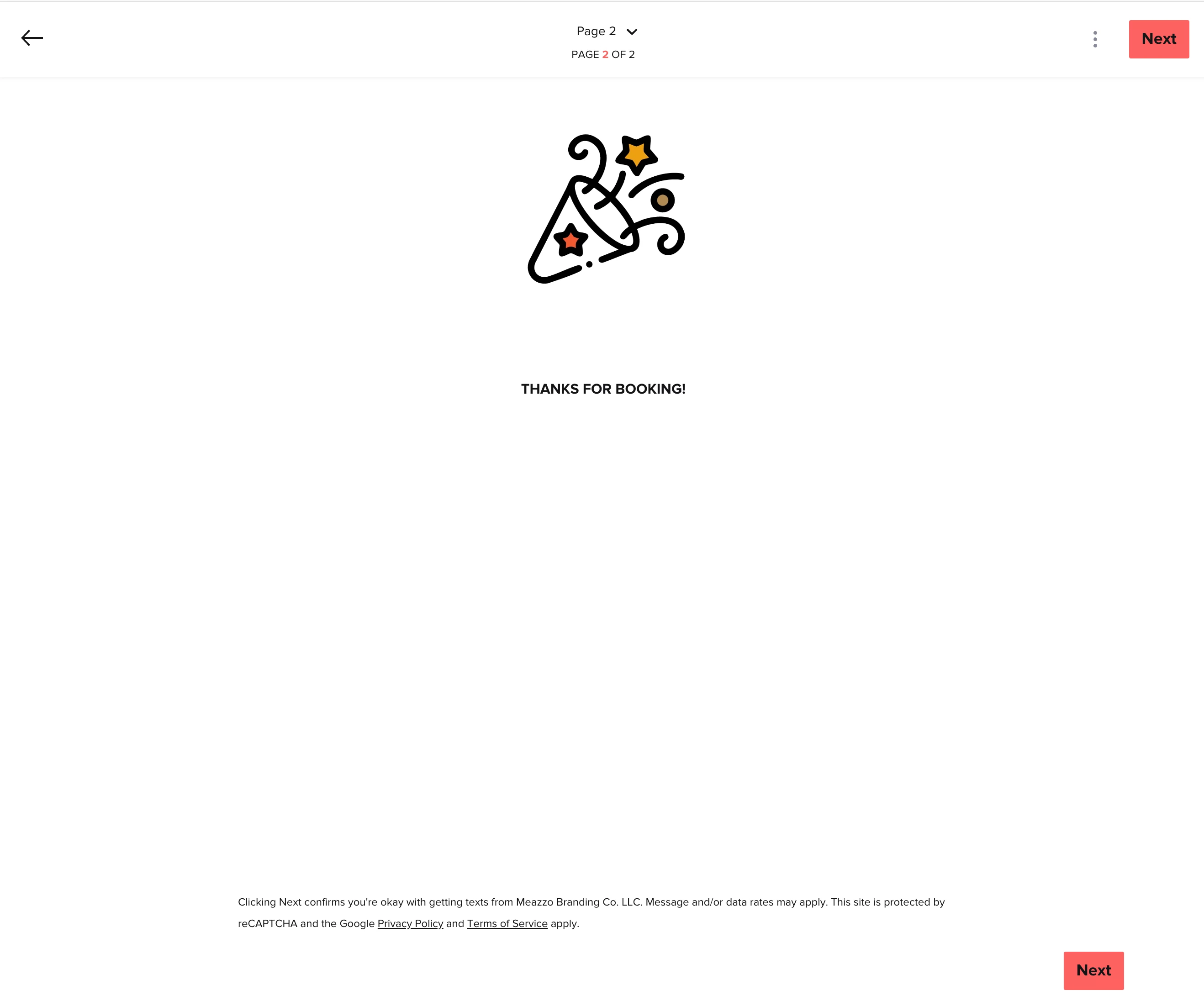
After the user selects a time and fills out this information they think they have finished booking because of the message and visual communication that they are done, but unfortunately if they do not click next from this page, it does not book them so this is really misleading and bad UX.
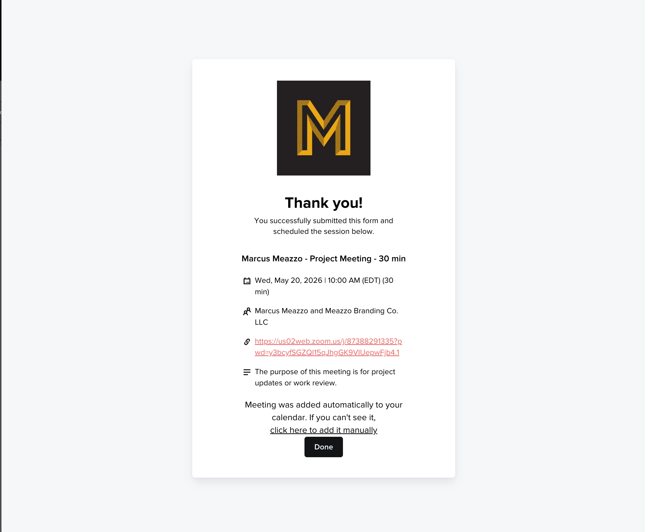
We do not need this page (the one with the celebrator graphic and “thanks for booking!”) as shown, After the user selects a time on the first page and fills out their info, once they click next it should just book them and go straight to the last image on this post (the one with Meazzo at the top).
Is there something I am missing? Can I delete this second page with this graphic?